 Tablets, Mobile Phones, Ipods, laptops… There are so many ways your clients can reach your website so it is important that your website looks great on all different types of technology. If you have a WordPress website you have several options for creating a mobile friendly website.
There are three basic ways you can create a mobile version of your website – Use wordpress plguins, create a custom mobile theme or convert your website to a responsive theme. I have explained each of these options below.
WordPress Plugins
There are many WordPress plugins that will give your site visitors a great mobile experience:
WPTouch – a mobile plugin that transforms your site for mobile users. It gives the visitor the ability to toggle between your mobile site and your regular site. There is a PRO (paid) version of this plugin.
Wapple Architect Mobile Plugin for WordPress – Wapple Architect Mobile Plugin for WordPress is a plugin that allows you to mobilize your blog in minutes.
Pros: Inexpensive or Free, Can be very easy to implement on existing WordPress sites
Cons: Doesn’t always work well with websites that are highly customized.
A Custom Mobile Theme
You can develop a custom WordPress Theme for mobile devices. You would have two themes for your site – your regular site theme and a mobile theme. When someone visits your site, your site will check what technology is being used and then display the appropriate theme. This option requires a plugin like Any Mobile Theme Switcher which will let you designate your mobile theme and adds the code necessary for your site to “switch” between the two themes.
Pros: Completely customized, you have total control
Cons: Price – you need to have a custom theme developed.
Responsive Theme
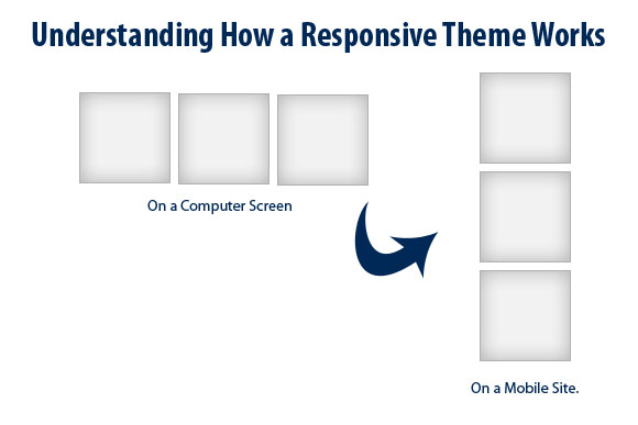
A Responsive Theme is a flexible foundation with fluid grid that basically collapses down to fit the width of mobile or tablets. In the simplest terms – think of the site layout as a bunch of boxes perhaps 3 wide when viewed on a computer screen. As the screen size/resolution decreases the boxes shift so they are sitting on top of each other.
Pros: This is a nice approach as it is an all in one solution and doesn’t rely on plugins or a second theme. Cons: Because of the way the site architecture needs to be built a responsive theme may mean compromising on your site layout.
If you are wondering what kind of technology is being used to access your website you can check your Google Analytics. (Go to Audience > Mobile > Devices). Your analytics will show you exactly what devices are being used. Pretty cool!
Are you ready to go mobile? Do you have other ideas on how to make your website mobile? Share them in the comments below.